
How to make your blog mobile friendly and responsive these queries are very popular these days. A blog’s suitability to mobile devices is essential for gaining the huge number of mobile Internet users and subscribers. There is a whole generation that is spending a great deal of time on surfing the internet through their smartphone so it is obvious to amend your blog’s settings and make it accessible to the greater number of people. As per the studies, approximate 20% of the entire internet traffic comes through these smart devices and avoiding such a remarkable number is rather un-affordable to any blogger or website owner.
In this article, we are going to discuss some popular and highly effective options to support your efforts for creating a Blog mobile friendly. You can consider one more from the following.
5 Popular and Highly Effective Option To Make Your Blog Mobile Friendly
1. Keeping your site unchanged
Your blog will be kept visible accessed to the mobile visitors even if you don’t make any change for its responsive designing. If you are not prepared for making any changes in a rush and want some more time to finalize the pattern and style of your blog mobile friendly appearance, you can consider this option and postpone your plans of changes for the future. Here you can face some specific problems or issues such as:
- An excessive amount of scrolling: As an ordinary website cannot be exactly fit on a mobile device so the user has to scroll up and down for a long to access the information and this generally makes them irritated.
- Pinch the text all the time: Here the text on your web page is very small to read and the readers have to pinch it all the time to enlarge it.
- Images and videos: An ordinary website also don’t facilitate the right sized visibility of the entire image of video on the screen and the readers have to scroll it.
- Speed: The time taken to get opened and downloading of pages, is not similar to the mobile device. Also, the larger images and videos may remain un– opened for a long time.

2. Developing a separate mobile friendly version for the website or blog
In this method, you simply build a new version of your website for the mobile device. Actually, here you have two websites for desktop and mobile applications separately. This mobile version of a website generally appears in the form of m.sitename.com.
While a user types your site’s query on his or her mobile, he or she is automatically directed to the website designed for mobile suitability. While you create a completely new website as the mobile version of your existing one, you can add much new content, concepts, layouts, images, formats, etc. in it.
The advantages and disadvantages of Mobile Friendly Version are as follows:
Advantages of mobile friendly version for the website:
- It is a less expensive method and sometimes it can be done without any significant cost.
- There is no requirement of any specific technical skill to build a mobile version of your website. One can perform the task without any a major headache or within a short time.
- While a separate version is a build for the requirements of the site’s mobile readers so it appears as a rather new website and not just the replica of the desktop version of the website.
Disadvantages of mobile friendly version for the website:
- As per the course of the time and due to changing markets and users demand, a web owner has to make regular changes in their websites. Here, in the case of two separate versions, he has to make changes or launch updates in the two websites each time. The task requires a double input of time and efforts.
- The redirection will be the next issue. For instance, a reader is exploring a site on his mobile and he shares its link to his friend, he is actually sharing the link to the mobile version of the site. And, if the friend receives it on his desktop and clicks on it the site displayed on his screen will be the mobile version and not the desktop version.
- In this case, you have two sites to suit the desktops and mobiles but the both are completely unsuitable for the tablet devices and they have a totally different display concept.
- Hare, you have to follow some specific Google Recommendations otherwise there will be an adverse effect on the SERPs rankings of your website. It can be damaged as your whole traffic is divided in the two separate directions.
- While you are using the services of a third party to build your site’s mobile version and then you’re hosting your site with them, your Google ranking is directly affected by this.

3. Go with a mobile friendly optimized theme
Under this concept of web suitable websites, a web owner actually has only one website, but while is opened but a mobile user on his mobile a spate version appears on his screen. This theme is specifically developed considering the mobile users and focus on the graphics, images and the other complicated technical functionalities. The comparative study of the method is given below:
Advantages of a mobile friendly optimized theme:
- Here is just one website and the different themes are served for the desktop and mobile versions.
- This website is comparatively light weighted and gets loaded very fast.
- It can be easily got up and start running.
Disadvantages of the mobile friendly optimized theme:
- This option is highly concerned with the display and the presentation of the graphics. While the mobile site is not working or appearing as identical to your site, you can lose a bit of branding here.
- If the web owner wants his website also be suitable for the tablet users, and then he will need to use some supportive themes for this purpose.
- Make it count that Google highly recommends the responsive theme.
Recommended Post: MyThemeShop Themes and Plugins
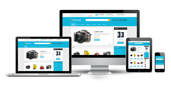
4. Creating a responsive and mobile friendly design for the blog
In this method, the content of a blog is automatically adjusted as per the size and the resolution of the user’s device. The method facilitates the web owner to make his blog successfully accessible by the different types of device users just by having a single set of content. The display layout is adjusted separately and automatically. This method is very popular and adopted by the most of the web owners and bloggers as it facilitates the easy display of the site or page to the different types of users and device holders. Though it needs a high web developing skills or hiring an expert developer to perform the task, its usability and functionality ultimately support the blogger to serve the maximum number of users and readers at the same time and with the same set of content.
Must Read:
why is responsive website important for your business
5. Development of a Blog mobile friendly application
There are many mobile friendly applications available online who can be downloaded and ran directly on a smart device and support it to access the suitable display of the site on its screen. Such applications are known as the Native mobile-friendly applications.
One can develop a decent user interface that is suitable for some specific phones or devices and also recommends the users for adopting such one for the better site display experience.
Due to the availability of a great variety of the devices on the market, it is impossible for a blogger to develop a native application to suit each one so it will be smart to suggest the users for downloading a right one mobile friendly application as per their device requirement.
Conclusion
Well, I’ve explained 5 popular and highly effective options to support your efforts for creating a mobile friendly blog. If you have any suggestions then share with us.


Great article… but i have an query that how to build same site for mobile?
Hi Udit
You can make your blog mobile friendly with the help of coding or by choosing a mobile friendly theme.
Thank you fo the valuable information. Now a days all are in smartphone so mobile friendly website or blog is essential.